
In 2006, I developed a new way displaying the long term success of an employer's 401(k) plan. The 401(k) Asset Accumulation Chart is a one page summary of 20 plus years of individual participant saving......from 50,000 feet.
Over the years, I had concluded that annual 401(k) plan summaries didn't tell much of a story. Recordkeepers and investment fund providers told companies that their 401(k) plan participation average was X%, the average participant deferred Y%, the average balance was $Z and total assets were now $ABC. A lot of meaningful useless data in my mind.
That's when I developed the concept for my original 401(k) Asset Accumulation Chart, shown below, which was a high level one page summary of the 401(k) plan's overall historical success for long term participants.
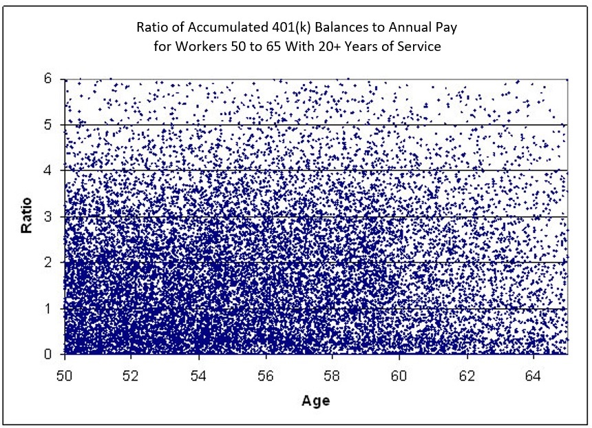
The Ratios shown at the left are from 0 to 6 and represent individual employee's Asset Accumulations as a ratio of their current annual pay. So, for example, the number 4 represents a 401(k) balance of four times the employee's annual pay.
The ages across the bottom are from 50 to 65 and include employees with more than 20 years of service, the length of time that many 401(k) plans have been around.
Each dot on the chart represents one person's asset accumulation at their current age and salary. From a high level we can see that most people from age 50 to age 60 have less than 3 times their annual salary saved in their 401(k) plan represented by the high concentration of blue dots from 0 to 3 on the bottom left of the chart. What is not relatively apparent is that almost 9% of the people shown on this chart have $0 401(k) plan assets represented by the solid blue line at zero.
Syl Schieber's paper, referenced below, showed that 39.6% of participants had accumulated less than one times their annual pay.
My recommendation is that individuals have at least 10 times their annual pay at age 65 retirement in their 401(k) or 403(b) plan, which respresented very few people in this study. In other studies using this chart, we saw that significantly less than 5% of participants had 10 times annual pay at age 65.
I received some outstanding comments on this innovative concept from several senior leaders at Watson Wyatt:
From: Schieber, Syl (US Benefits)
Sent: Saturday, April 22, 2006 11:14 AM
To: Morgan, Russ (Dallas)
Cc: Wickes, Gene (Denver); Shaddy, Jim (Minneapolis)
Russ, This is fantastic. It captures pictorially just exactly what we are saying. Everyone ought to be doing this. I will broadcast far and near and give you credit as I go.
S.J.S.
Sylvester J. Schieber
Vice President, Director US Benefits Consulting, Watson Wyatt & Company
* The version of my chart shown above was included in a white paper by Syl Schieber entitled Workforce Management and Retirement in a 401(k) World.
From a Gene Wickes meeting at a Society of Actuaries Conference in 2007, where he was presenting new concepts and ideas:
"I used this chart in 12 different meetings with clients who were going to freeze or terminate their Pension Plans. After my presentation, 11 of the 12 decided to keep their Pension Plans."
The chart shown above was the first one I developed. I now have close to 20 new charts that show additional high level summaries of 401(k) plans. I will be posting some additional charts in the near future but, but in the mean time, please contact me if you would like to discuss your plan's issues and what I can do for you.
The 401(k) Asset Accumulation Chart